

Do Not Disturb
We spend a third of our lives in them, yet they’re often the last space we give proper attention to. The bedroom isn’t just a place to sleep, it’s where the day begins and ends, where thoughts unwind, and sometimes, where laundry goes to hide. Whether you’re after a sanctuary of calm, a statement of style, or just a room that makes getting out of bed slightly harder, design matters. This feature explores the bedrooms that get it right, from soft neutrals and natural materials to bold statements and quiet luxury. Whatever your sleep style, there’s something here worth waking up for.
Mellow Yellow
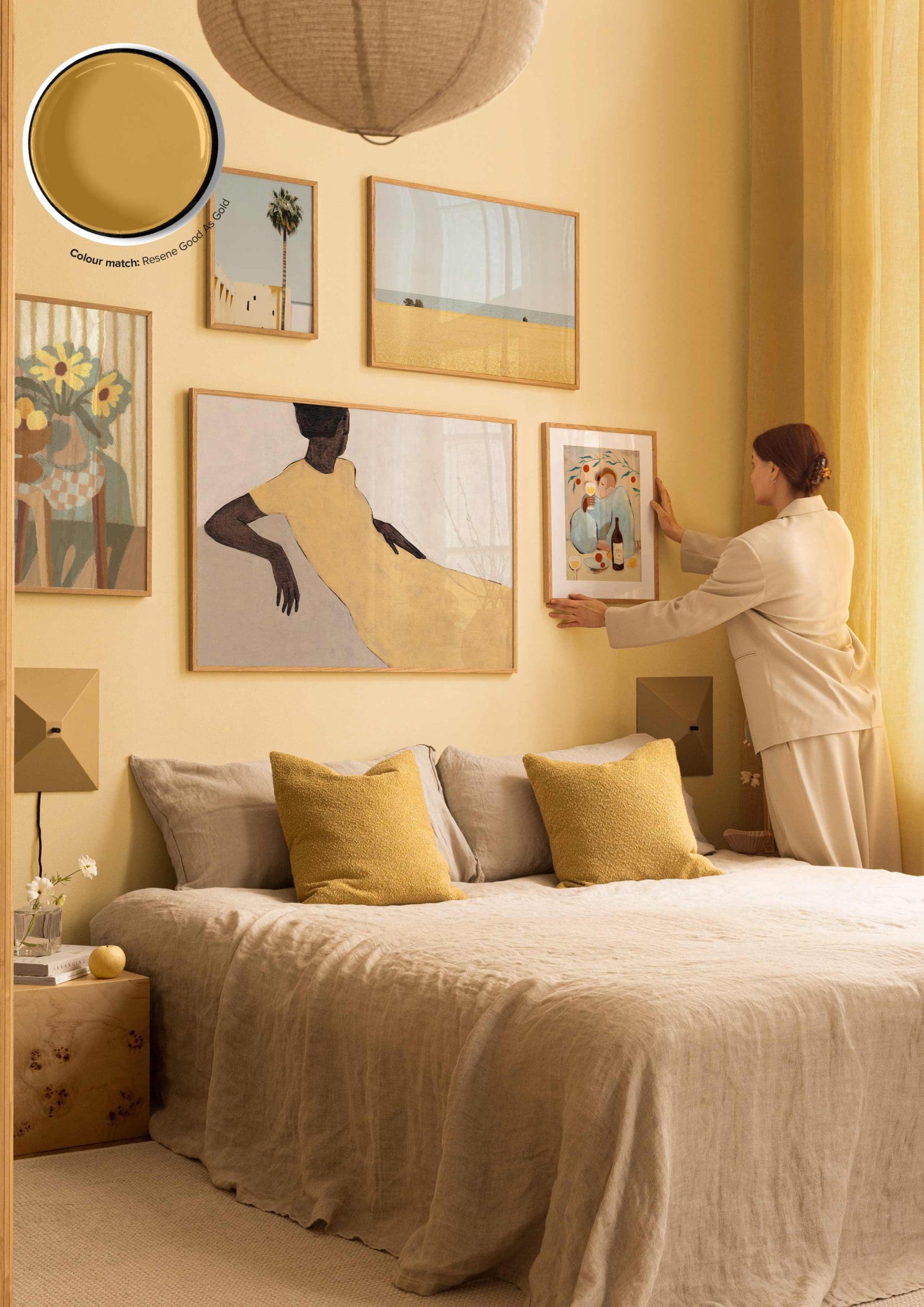
This butter-yellow bedroom, decorated with Desenio artwork, makes a strong case for tone-on-tone living. Soft, layered, and sun-warmed without being too sweet. The linen bedding keeps things casual and breathable, while the mustard cushions add just enough contrast to stop it all from blending into mashed banana.
The gallery wall is where the real styling happens, different styles and subjects, but everything sticks to a warm, cohesive palette. Matching frame tones is what keeps it feeling intentional, not like you panic-bought five prints the night before hosting.
Sheer curtains, minimal bedside styling, and natural textures help round things out. It’s relaxed, polished, and a solid reminder that yellow doesn’t have to be loud to make a statement.
Beige Brigade

Beige is back baby. Well maybe not quite but there is always a place for natural tones.
The Domkapa bed leads the scheme. Fully upholstered and low to the ground, it adds visual weight without making the room feel crowded. The curved headboard softens the geometry and helps the bed blend with the rest of the space.
Everything else follows the same formula. The linen bedding, dense rug, and light brick wall all sit within a similar palette. Variation comes from material contrast rather than colour. It is a useful strategy for designing a calm bedroom that still feels finished.
Artwork is kept abstract and unobtrusive. The timber bedside table introduces a different texture and a subtle curve, which stops the look from feeling overly repetitive.
For anyone designing with neutrals, this space shows that consistency is not the same as dull. A limited palette, handled with restraint, can still feel warm and intentional.
Industrial Superpower
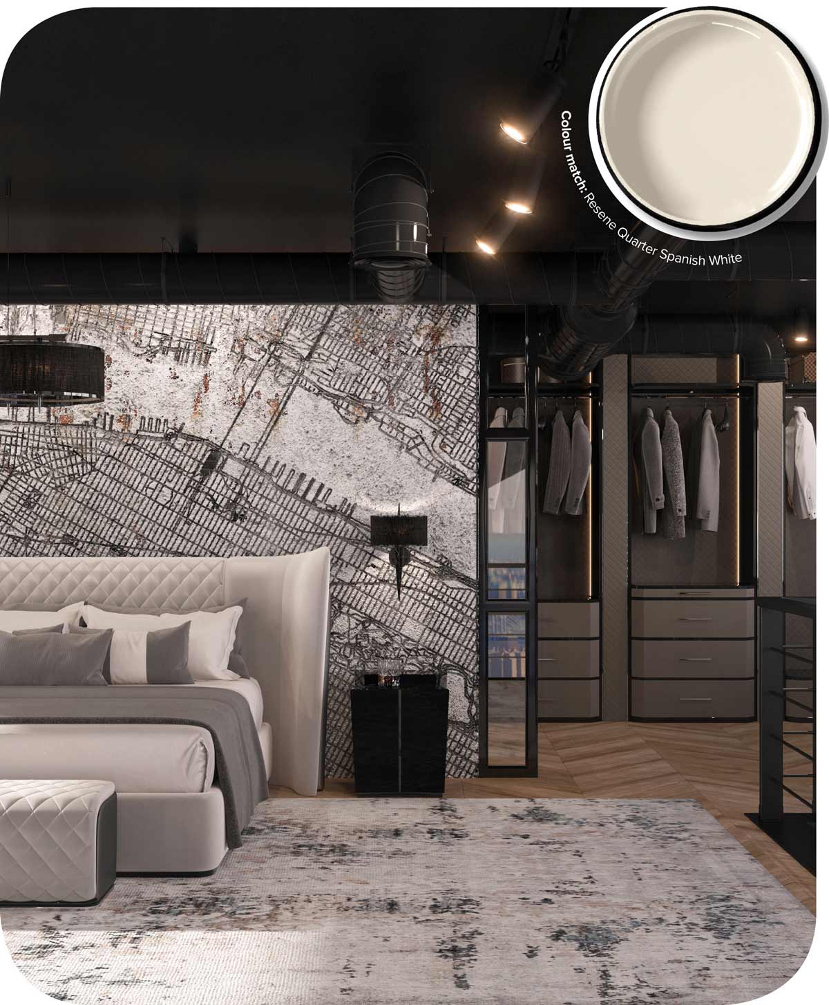
Industrial doesn’t have to mean cold, and minimal doesn’t have to mean bare. This bedroom shows how urban edge and high design can work together without losing comfort. Polished materials and sharp lines sit alongside plush textures and soft finishes, creating a space that feels intentional but not clinical.
The feature wall brings a LUXXU graphic, architectural feel that anchors the room without relying on colour. It adds scale, texture and a subtle sense of movement. The quilted bed balances this with height and softness, while the grey-on-white palette keeps everything cohesive.
Lighting and exposed ductwork are fully integrated into the design rather than concealed. The walk-in wardrobe is open, symmetrical and exact, with glossy drawers and lit display rails that lean closer to retail than residential. It’s highly ordered but still liveable.
For anyone drawn to modern interiors with a sense of drama, this is a reminder that monochrome can be layered, and that clean doesn’t have to mean quiet.
Natural Selection
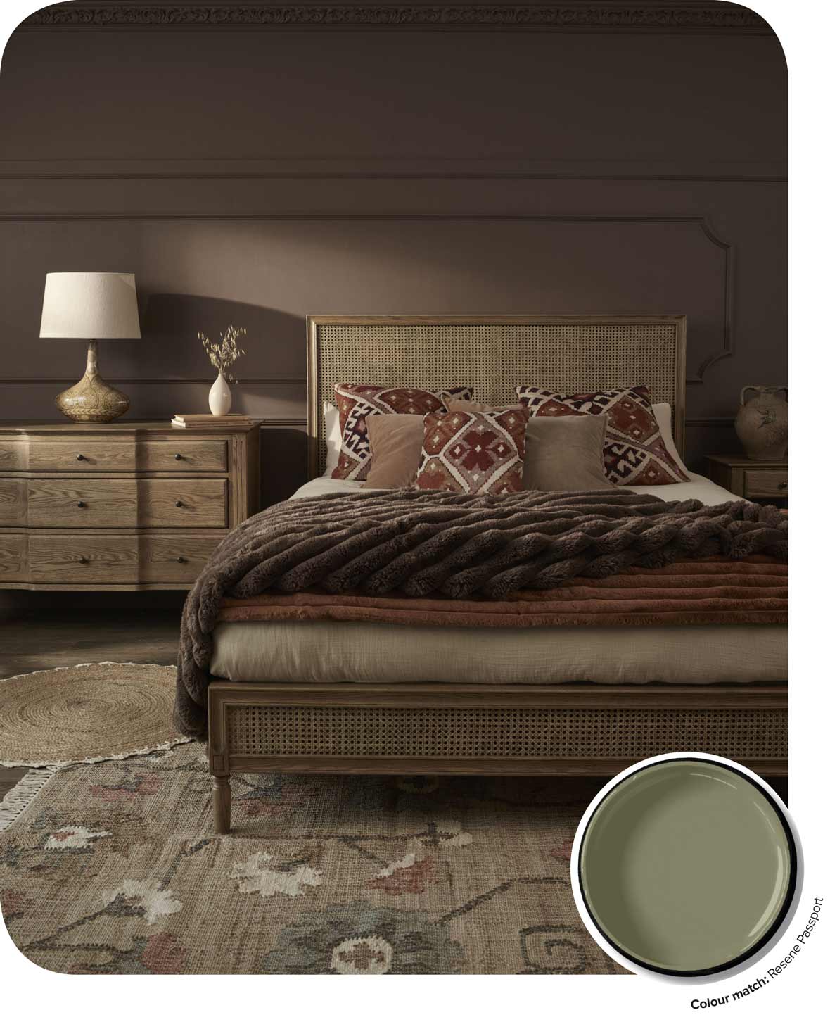
There’s an old-school charm in leaning into natural materials. Cane, timber, wool and cotton all bring texture and warmth without relying on trends or high-gloss finishes. When combined with a muted palette, they create a space that feels both grounded and enduring.
The Love Story Srnit Rattan Bed from French Bedroom sits comfortably in this mindset. The woven cane panels and soft timber frame give it presence without bulk. Paired with terracotta and rust-toned textiles, the look is layered but not busy.
Pattern is kept minimal and softened through vintage-style rugs and tonal cushions. The key here is restraint. Letting materials and colour do the work keeps the space calm and tactile.
Furniture choices follow the same line. A simple wooden dresser and ceramic lamp stay within the natural palette, adding functionality without distraction. For anyone drawn to spaces that feel warm, timeless and a little more lived-in.
Flower Power

There’s something quaintly optimistic about blue and white florals. The Hannah Rose Bed Linen Set from French Bedroom takes that idea and runs with it, delivering a print so densely patterned you may find yourself trying to spot a hidden dolphin if you grew up with Magic Eye posters. Spoiler: it’s just flowers.
Tied bows at the base and on the pillows add softness, while the colourway keeps it fresh rather than fussy. The upholstered headboard in a muted sage-grey pulls the scheme together and stops the print from taking over entirely.
The timber floor, jute rug, and woven basket styling ground the look and keep it from feeling too sweet. If you like the idea of print but don’t want to commit to wallpaper, patterned bedding like this is an easy, low-risk way to bring character into a bedroom.

Chill out in this relaxed urban haven

Refine your life in this masterpiece home

Pare it back with this sleek and modern home

Live a lodge life in this hearty home