

Back to The Bronze Age
Back in the 70s, before cold stainless steel and chrome became the metal hue of choice for any modern household, bronze and brass ruled the roost. If anything could be cast in an off-gold alloy, it was. From tapware to door handles to lighting, even to those weird bronze pineapple bookends, we just couldn’t seem to get enough of the stuff.
While it might have been a bit overkill back then, designers are leaning back into the warmth of these forgotten metals, albeit with a bit more restraint these days. Think of them as punctuation for your space. One statement light, a slim table detail, a mirror frame that catches the evening sun. Pick a finish that suits the mood. Brushed or satin for softer rooms, polished for a sharper edge, antiqued if you want instant character. In this feature, we show how a few well-placed pieces can shift a room from fine to finished, with examples you can lift straight into your own home.
Brass Tactics
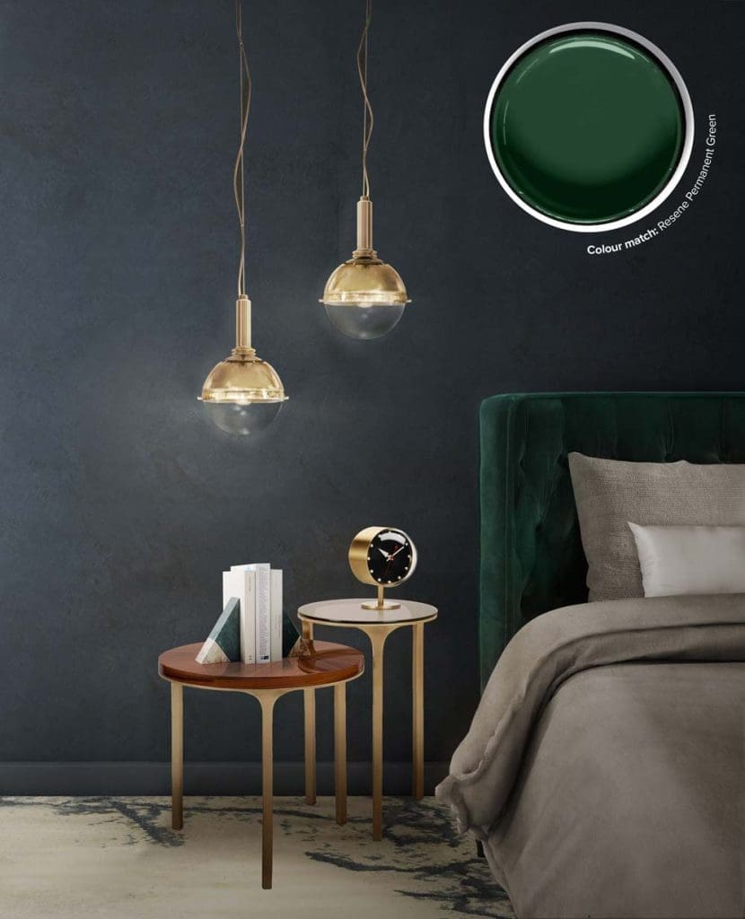
Brass brings warmth and clarity to a bedroom, and this pairing shows how to use it with restraint. The NIKU pendant lights from Brabbu Design Forces, Portugal, create a focused pool of light that works for reading and soft ambient glow. The LURAY side tables, also by Brabbu, add a refined note with brushed brass legs and mixed tops in palisander veneer and bronze glass.
Deep, cool wall colour and an emerald headboard allow the metal finishes to stand out without feeling flashy. Keep textiles matte and tactile so the brass remains the highlight. If you are introducing brass for the first time, start with one key piece such as a pendant or bedside table, then repeat the finish once more in a smaller accessory for a cohesive look.
Soft Touch
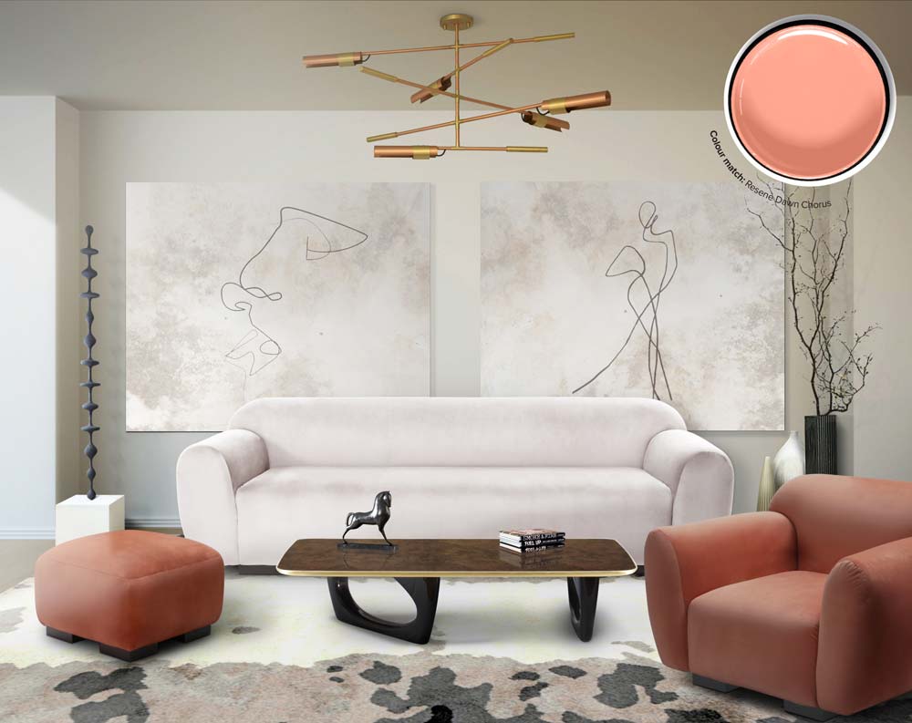
When a bronze statement is doing the talking, it is sometimes nice to let everything else step back. Use a muted backdrop in soft whites or stone greys, keep finishes matte, and balance the heat of the metal with cooler, lighter furniture. In this room, the sculptural bronze chandelier takes centre stage while Brabbu’s OTTER Sofa, OTTER Single Sofa and OTTER Ottoman do the calming work with rounded forms and soft blush-and-oat upholstery.
The contrast feels intentional because the furniture is low and plush, the art is quiet, and the palette stays restrained. Echo the metal once, maybe twice, a slim edge on the coffee table or a small accent on the mantel, and leave it there. Linen, bouclé and wool add texture without noise, warm-white light keeps the glow flattering, and the hero bronze gets the space it needs to shine.
Filament of Surprise
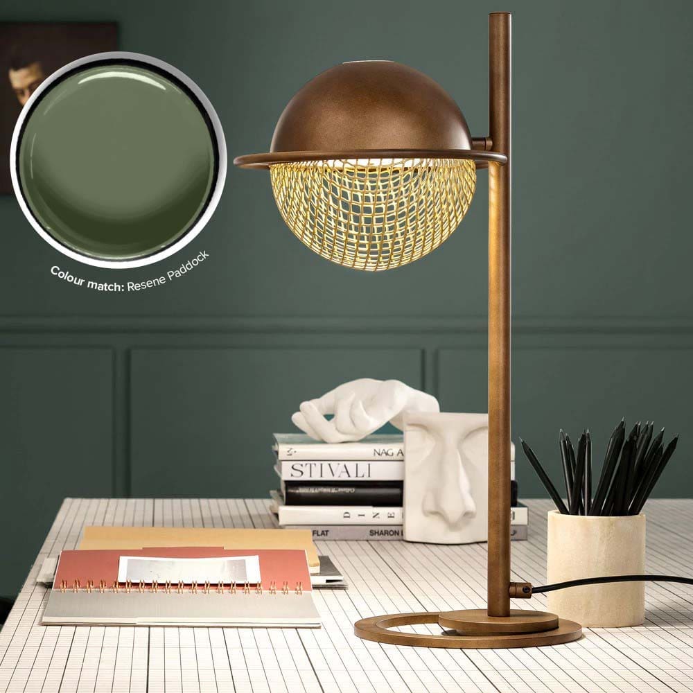
Brass and bronze are easy ways to add depth and a little intrigue to a room. Start with a single, well-made piece that earns its place, then echo the finish once or twice so it feels intentional. The Modern Round Table Lamp from Juliettes Interiors is a good example. Its bronze patina and soft gold mesh create a warm, controlled glow that works for both task light and mood light.
You do not have to buy everything new. A retro or steampunk find from a second-hand store can bring character to a space. Look for pieces with real weight, patina and simple mechanics. Pair them with clean surfaces and tactile textiles so the metal is the highlight rather than visual noise.
Placement matters. Keep metallic lighting slightly forward of your sightline to avoid glare, and aim for warm white bulbs around 2700–3000K to flatter skin tones and materials. Use darker paint or stone to make brass read richer, or set it against pale timber for a softer look. The goal is quiet drama, not a theme park.
Cool Glam
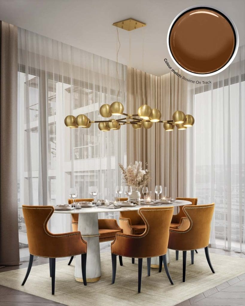
This is a good example of soft brass used for atmosphere rather than spectacle. The Horus suspension reads satin rather than shiny, so it warms the room without competing with the Agra marble table. Dukono chairs in russet velvet bring colour and texture, while the pale rug and sheer curtains keep everything airy.
If you are after a gentler brass look, choose brushed or satin finishes and pair them with natural stone and light textiles. Repeat the metal once at floor level or in hardware, and let the fabric carry the richness. Keep centrepieces low and simple so the soft glow can do the work. The result is calm, welcoming and easy to live with.
Add a rug that’s at least 60 cm wider than the table on all sides so chairs slide without catching. Keep chair legs dark or timber so the satin brass stays the hero, and use brushed metal cutlery rather than high-shine to match the softer finish above. If you want a little contrast, swap in one cooler accent like smoked glass tumblers to stop the scheme from feeling too warm.
Flutey Tooty
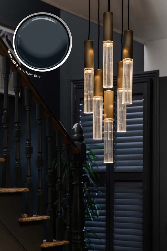
A cluster pendant is the easiest way to turn height into drama. J. Adams & Co’s Flume 50 uses antique brass and bronze bodies with reeded glass to throw a soft, glare-free glow. The concealed LED keeps the focus on the texture, so you get warmth and sparkle without hard hotspots.
This works especially well in stairwells and double-height spaces where a single shade gets lost. Stagger the drops just above eye line on each landing so the glass catches the light as you move. Pair with deep wall colours for contrast, or keep it crisp over pale walls and let the brass do the warming. If your room already has brass hardware, echo the finish with a small accent nearby so the feature feels integrated.
Marble Meets Metal
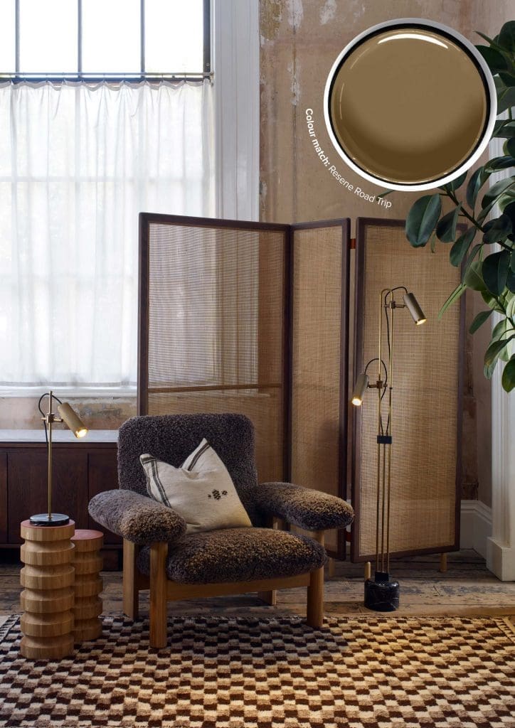
A reading corner works best when each element earns its place. Use a woven screen to carve out a quiet zone, then anchor it with a substantial chair in something tactile like shearling or bouclé. Keep surfaces practical. A side table set to arm height makes books and cups easy, and a chunkier patterned rug grounds the furniture without stealing attention.
Let metal act as the accent, not the theme. J. Adams & Co’s Spot Table and Spot Floor Lamps in antique brass with black marble bases bring definition and polish. Echo the brass once more in a small object or hardware so it feels deliberate, then stop. Vary heights between screen, lamp, chair and table for a simple rhythm, and leave a little negative space so the corner feels calm rather than crowded.
Mixing stone and marble with brass and timber is the shortcut to depth. Cool, honed marble tightens the look, warm brass adds edge, and natural wood keeps it approachable. If you are layering stones, change the finish rather than the colour. Polished on the tabletop, honed or leathered at the base, with a subtle vein that plays well with the rug pattern. Tidy the practicalities with concealed cords and a tray for small things, and the nook will look considered and stay that way.
Gilded Green
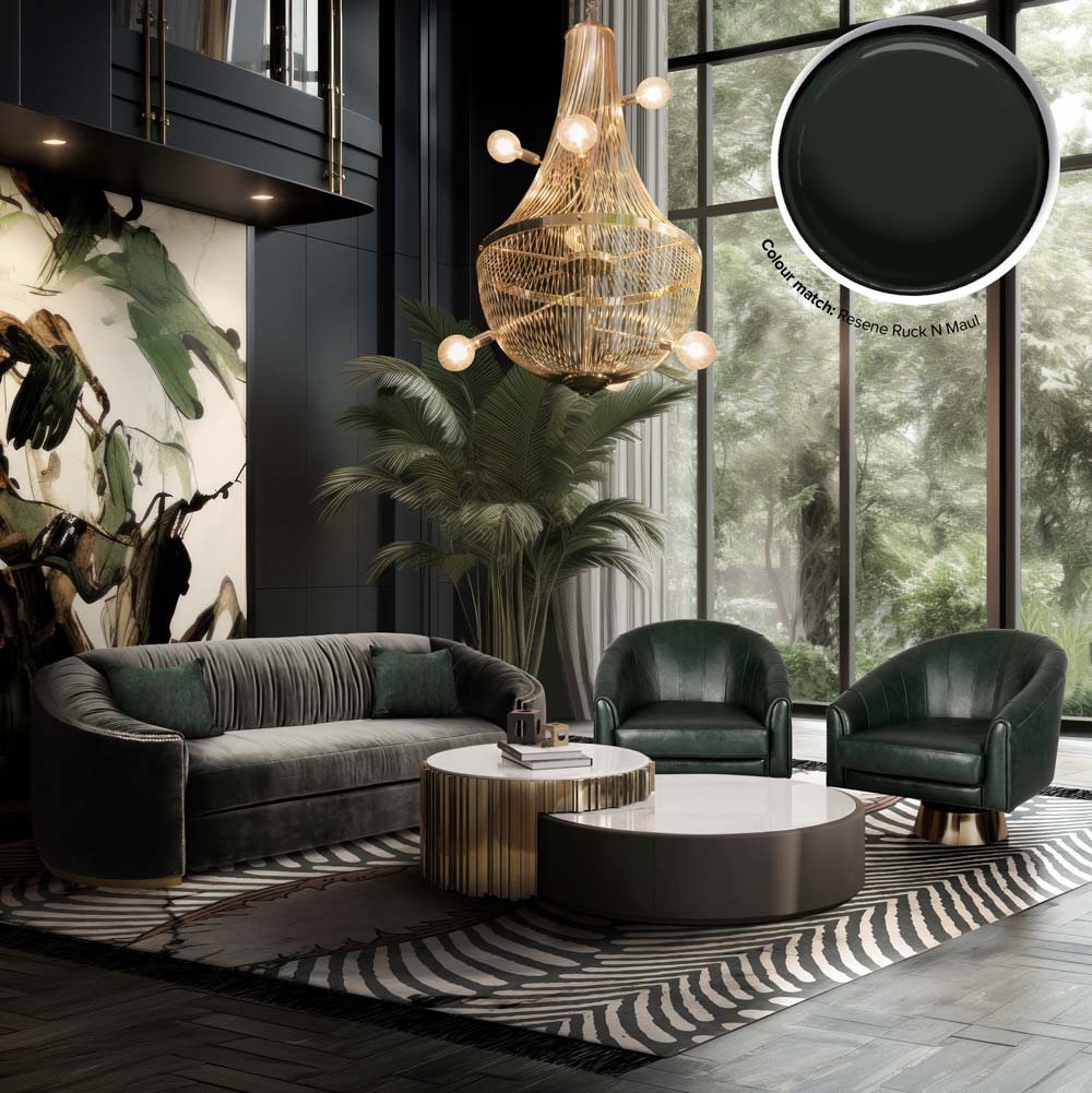
Green loves brass because they sit opposite on the warmth scale. The cool depth of forest and bottle tones makes yellow metal read richer, while the brass returns the favour by warming the green and pulling out its luxe side. Covet House’s Wales sofa and Bogarde armchairs carry the colour with dense velvet so the shade stays saturated. The Empire Center Table Set I brings bronze brass to the centre of the room and L´Chandelier repeats the metal above, which is enough to lock the palette without flooding the space.
If you are chasing this balance at home, pick your green first. Darker greens take polished or satin brass well; lighter sages prefer brushed or antique finishes. Keep walls deep and matte so the metal can glow cleanly and the upholstery keeps its shape. Limit brass to two or three moments that your eye can connect: a chandelier, the table detail, and a small accent like a lamp base or tray. Add one pale stone surface to cool things slightly and avoid an all-warm scheme.
Texture is your friend. Velvet or mohair for the green pieces, ribbed or fluted metal on the table base, and a rug with a strong, grounded pattern will keep the look composed. Bring in a single tall plant to echo the green in a softer register. The aim is dialogue, not competition: green provides the depth, brass adds the glow, and the room feels confident rather than busy.
Sphere of Influence
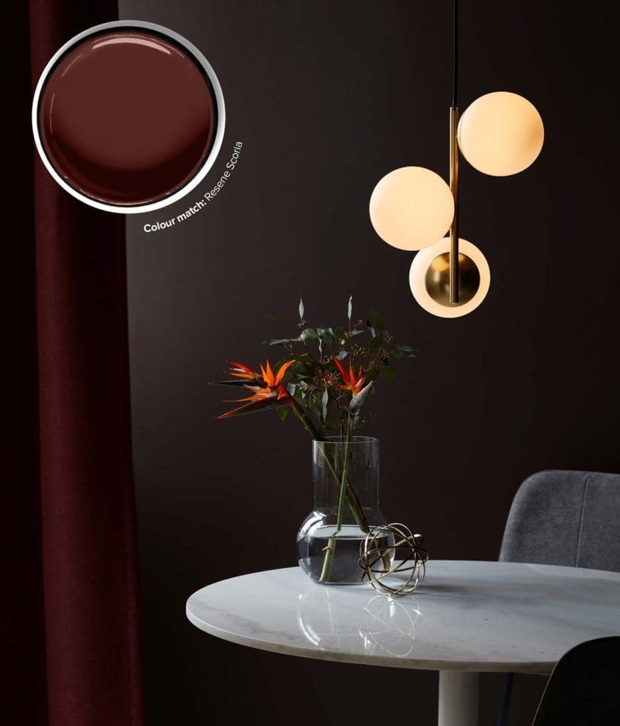
Consider this a straightforward example of how a single brass piece can lift a room. The Lilly Pendant Light from Lime Lace combines a slim brass stem with three opal globes that diffuse light evenly, so you get warmth without glare. Hang one over a side table or use a pair over a kitchen island to create a soft pool of light and a clear focal point.
The materials do the work. Brass adds warmth. Opal glass keeps the glow gentle. If you want the pendant to read as a feature, place it against a darker wall so the globes stand out. If you prefer a lighter look, echo the round forms over pale stone or marble. Repeat the brass once more in a small object or frame so it feels integrated with the rest of the room.
Polished Dinner
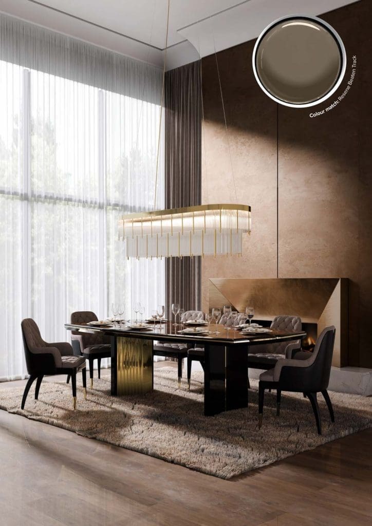
This setting shows how to let polished brass do the talking without overwhelming the room. The Beyond Dining Table mixes a dark, reflective top with brass detailing, so you get warmth and a little glamour while the surface still reads tailored. Charla chairs in soft, cool upholstery hold the balance and stop the metal from feeling hot. Pharo’s linear suspension spreads the glow evenly along the length of the table, which is what you want for long dinners and fewer shadows.
Keep the background calm and textured. Sheer curtains, a plush rug and stone or plaster walls take the edge off the shine and add depth. If you have a strong brass table or light, repeat the metal once more in a quiet detail like chair feet or a tray, then let the rest of the finishes stay matte. Black accents help define the silhouette and give the brass contrast. On the table, go low and simple with a single centrepiece or a run of small votives so sightlines stay clear. The result is warm, confident and usable, not just a showpiece.

Chill out in this relaxed urban haven

Refine your life in this masterpiece home

Pare it back with this sleek and modern home

Live a lodge life in this hearty home